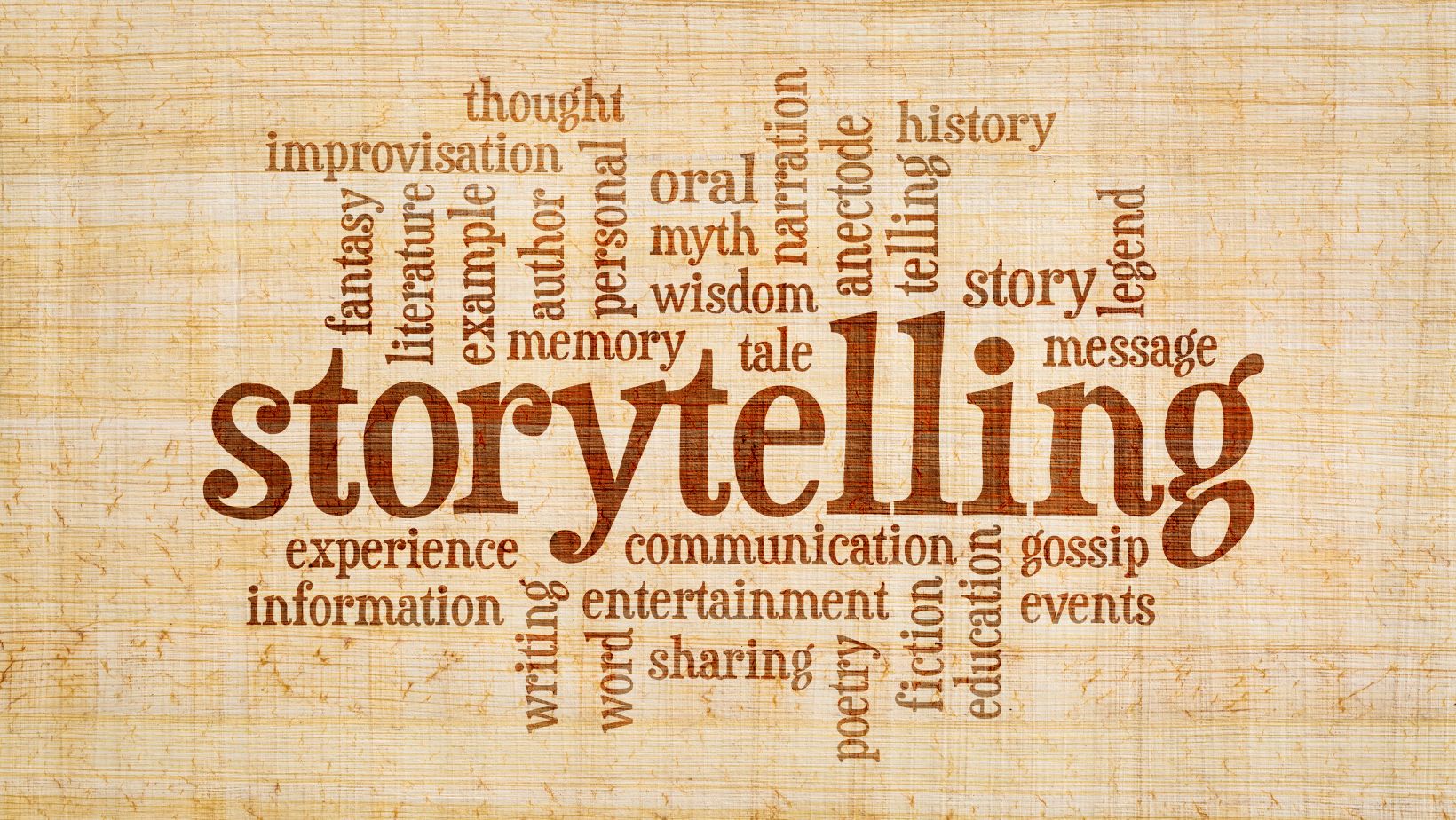
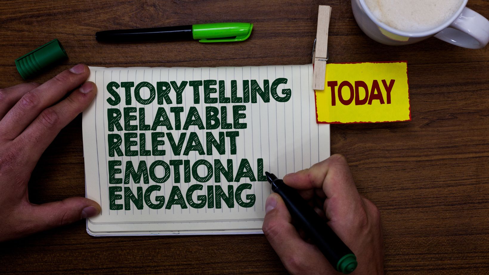
Typography is one of the most underestimated tools in visual storytelling. While images, colors, and layout often get the spotlight, the font style you choose can powerfully shape the emotional experience of your audience. Whether you’re designing a digital comic, an indie film title screen, or an immersive website experience, using the right typeface can elevate your work from functional to unforgettable. If you want to experiment with dramatic or thematic fonts, a calligraphy generator can be a great starting point.
Font Choices as Emotional Cues in Storytelling
In visual media, fonts are never neutral. Every serif, curve, and spacing decision communicates something—whether deliberate or accidental. A vintage script font can evoke nostalgia, while a jagged, sharp typeface might introduce suspense or unease. This emotional undercurrent becomes part of the narrative language, often before a single word is read. Consider the difference between using a playful, rounded font for a children’s book cover and a stark, minimalist one for a psychological thriller. The message starts at the first glance.
This is especially critical in mediums where text and imagery are closely intertwined, such as graphic novels, animation, and interactive design. Typography doesn’t just accompany visuals—it punctuates them, mirrors them, and sometimes even contradicts them for dramatic effect. It helps direct the audience’s attention and prepares them emotionally for what they’re about to experience.
When font style is aligned with visual and narrative tone, it reinforces the mood. But when it’s mismatched, it creates dissonance that can weaken the story’s impact. That’s why choosing the right typographic style should never be an afterthought.
Building Atmosphere Through Lettering
Atmosphere in visual media is constructed through a careful blend of tone, texture, and pacing. Typography acts like the soundtrack of the visual script—silent, but emotionally resonant. An ornate gothic typeface, for example, can transport the viewer to a haunted cathedral or an ancient manuscript. On the other hand, a sleek, futuristic font may signal sci-fi themes, high-tech settings, or artificial intelligence.
Subtle shifts in weight, height, and spacing also help build nuance. Tall, condensed fonts create tension and urgency. Broad, serif-heavy fonts feel grounded and historical. Curved, flowing scripts introduce elegance or fantasy. Even distortion or intentional “imperfections” in the lettering can heighten a sense of unease or surrealism.
Marlene Widawer, a calligraphy and font expert at Creative Fabrica, emphasizes this emotional power in type:
“Typography is not just about letters and spacing; it is an emotional language. Every style conveys a unique feeling, setting the tone of your digital narrative. Choosing an aesthetic font can instantly elevate your message, making it more memorable and engaging.”
Choosing the right typographic style is not about following trends—it’s about identifying the essence of your story and giving it a visual voice.
How Typography Drives Narrative Progression
Beyond establishing tone, typography can also guide the flow of your story. Strategic changes in font weight, size, or style can signal a shift in time, place, or emotional state. In multimedia presentations and motion design, kinetic typography—animated text takes this even further by physically embodying narrative motion.
Imagine a scene transition in a digital comic where the font slowly fades, distorts, or fractures—this suggests memory loss, fear, or a breakdown in the storyline. Conversely, clear and clean font transitions can reinforce clarity, resolution, or optimism.
Here’s how typography can support narrative pacing:
- Hierarchy of attention: Using different font sizes or weights to indicate dialogue versus narration.
- Mood shifts: Changing font styles at key emotional turning points in the story.
- Setting cues: Introducing region-specific or era-appropriate typefaces to hint at time/place.
- Character identity: Assigning distinct fonts to different voices or inner monologues.
In each case, typography becomes more than just text—it becomes performance.
Incorporating Typography into Your Visual Design Process
Designers and storytellers often treat fonts as a final layer—something added at the end of a creative process. This is a missed opportunity. Typography should be integrated from the beginning, alongside layout, color palette, and visual motifs. When chosen early, a font can inspire the tone of your entire project.
Start by creating a visual identity guide for your story or project. Select a few complementary fonts that represent different aspects of your narrative—such as a main title font, a body text font, and an accent or decorative font. Think of this as casting characters in your story. Each font has a role to play.
Limit yourself to two or three styles to maintain cohesion. Experiment with alignment, spacing, and overlays to create texture and movement. And always test your typography in the actual medium it will live in—what works in a static poster might fall flat in an interactive app or animated video.
Finally, don’t shy away from digital tools that allow you to experiment freely. The calligraphy generator is one such tool that can help you prototype styles that may later evolve into custom lettering or animated sequences.
Final Thoughts
Typography is more than an accessory to storytelling—it’s a co-author. Each curve, slant, and serif has a voice, and when used intentionally, it strengthens the narrative. Whether you are crafting a horror trailer, an experimental zine, or a short animated feature, the right typeface will not only enhance readability but also deepen emotional resonance.
In visual storytelling, words are seen before they are read. That first impression lingers, often coloring the viewer’s perception of everything that follows. When typography is used skillfully, it becomes an invisible narrator—guiding tone, influencing mood, and adding depth to every scene.